Formatting Reports
Analysis Reports are built dynamically based on information in the details JSONField, which is stored as a list of dictionaries.
Each dictionary in the list is treated as a Section in the report, with optional parameters. Sections are displayed in order, and can be provided with a title, description (to go below the title), a list of dictionaries containing the content (tables and/or plots) to display in the section, and notes to go after the content.
Note
The original version of MxLIVE reports is documented in Reports.
Section Options
'title': '',
'description': '',
'notes': '',
'style': '',        # CSS class to be applied to the section
'content': []       # list of dictionaries, each one describing a table or plot to display
Content Options
'title': '',
'description': '',
'notes': '',
'style': '',        # CSS class to be applied to the content
'kind': ,           # Supported types are 'barchart', 'columnchart', 'histogram', 'pie', 'scatterplot', 'lineplot', 'timeline'
'header': 'row',    # For tables only. Options are 'row', 'column', or 'column row'
'data':             # {} for plots / [] for tables
See sample tables, plots, and charts for detailed options. In general, colour definitions are optional.
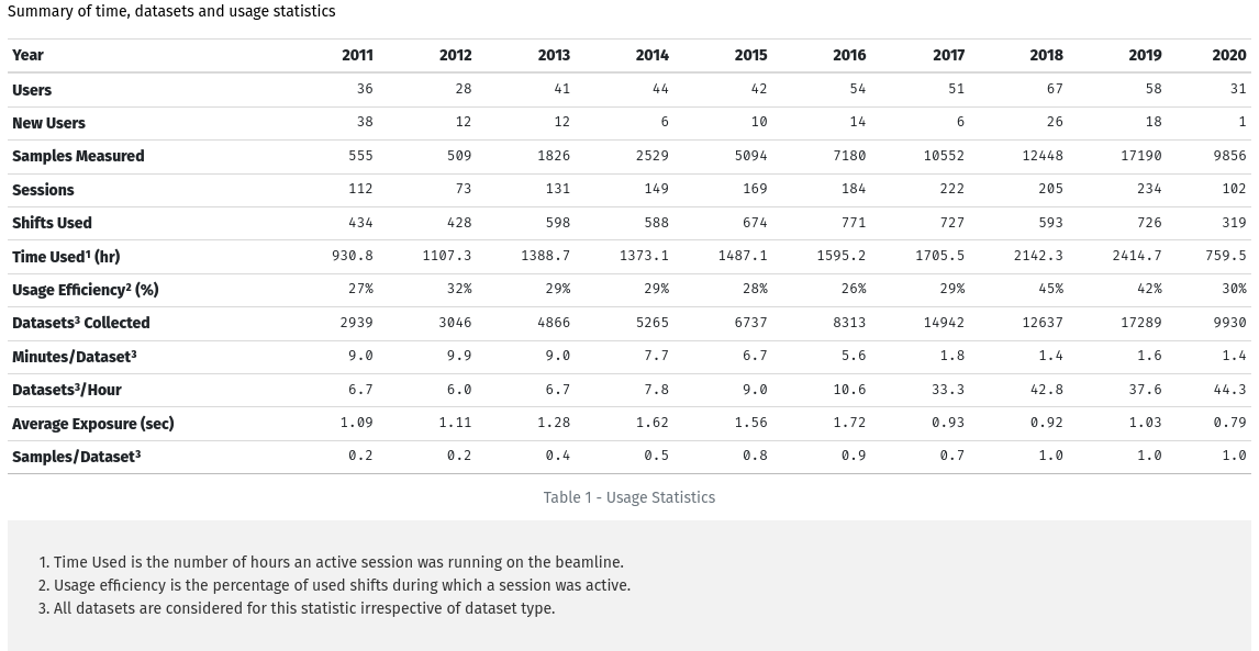
Sample Report Items
Tables
{
    "title": "Metrics Overview",
    "style": "row",
    "content": [
    {
        "title": "Usage Statistics",
        "kind": "table",
        "data": [["Year", 2011, 2012, 2013, 2014, 2015, 2016, 2017, 2018, 2019, 2020],
                 ["Users", 36, 28, 41, 44, 42, 54, 51, 67, 58, 31],
                 ["New Users", 38, 12, 12, 6, 10, 14, 6, 26, 18, 1],
                 ["Samples Measured", 555, 509, 1826, 2529, 5094, 7180, 10552, 12448, 17190, 9856],
                 ["Sessions", 112, 73, 131, 149, 169, 184, 222, 205, 234, 102],
                 ["Shifts Used", 434, 428, 598, 588, 674, 771, 727, 593, 726, 319],
                 ["Usage Efficiency\u00b2 (%)", "27%", "32%", "29%", "29%", "28%", "26%", "29%", "45%", "42%", "30%"],
                 ["Datasets\u00b3 Collected", 2939, 3046, 4866, 5265, 6737, 8313, 14942, 12637, 17289, 9930],
                 ["Minutes/Dataset\u00b3", "9.0", "9.9", "9.0", "7.7", "6.7", "5.6", "1.8", "1.4", "1.6", "1.4"],
                 ["Datasets\u00b3/Hour", "6.7", "6.0", "6.7", "7.8", "9.0", "10.6", "33.3", "42.8", "37.6", "44.3"],
                 ["Average Exposure (sec)", "1.09", "1.11", "1.28", "1.62", "1.56", "1.72", "0.93", "0.92", "1.03", "0.79"],
                 ["Samples/Dataset\u00b3", "0.2", "0.2", "0.4", "0.5", "0.8", "0.9", "0.7", "1.0", "1.0", "1.0"]],
        "style": "col-12",
        "header": "column row",
        "description": "Summary of time, datasets and usage statistics",
        "notes": " 1. Time Used is the number of hours an active session was running on the beamline.  \n
                   2. Usage efficiency is the percentage of used shifts during which a session was active.  \n
                   3. All datasets are considered for this statistic irrespective of dataset type."
    },
}
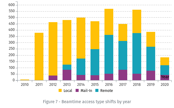
Column Charts
Example 1: Stacked Column Chart
{
    "title": "Beamtime access type shifts by year",
    "kind": "columnchart",
    "data": {
        "x-label": "Year",
        "stack": [["Local", "Mail-In", "Remote"]],
        "data": [
            {"Year": 2010, "Local": 8.0, "Mail-In": 0, "Remote": 0},
            {"Year": 2011, "Local": 380.0, "Mail-In": 0, "Remote": 0},
            ...,
            {"Year": 2019, "Remote": 192.0, "Mail-In": 76.0, "Local": 119.0},
            {"Year": 2020, "Local": 63.0, "Mail-In": 42.0, "Remote": 79.0}
        ],
        "colors": {"Local": "#FFC107", "Mail-In": "#8F3A84", "Remote": "#17A2B8"}
    },
    "style": "col-12 col-md-6"
}
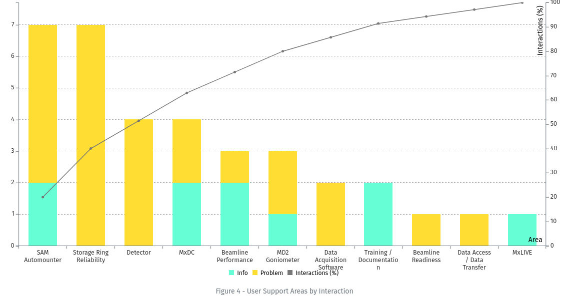
Example 2: Pareto Chart
{
    'title': 'User Support Areas by Interaction',
    'kind': 'columnchart',
    'data': {
        'aspect-ratio': 2,
        'colors': {"Info": '#66ffd5', "Lost Time (hours)": '#ffa333', "Problem": '#ffdd33', "Interactions (%)": '#777777'},
        'x-label': "Area",
        'line-limits': [0, 100],
        'line': "Interactions (%)",
        'stack': [["Info", "Problem"]],
        'data': [
            {'Area': 'SAM Automounter', 'Info': 2, 'Problem': 5, 'Interactions (%)': 20.0},
            ...,
            {'Area': 'MxLIVE', 'Info': 1, 'Problem': 0, 'Interactions (%)': 100.0}
        ]
    },
    'style': 'col-12 col-xl-6'
}
Bar Charts
A bar chart is essentially a Column Chart with horizontal bars. All options available for Column Charts are also available for Bar Charts.
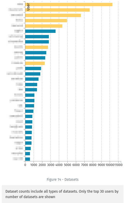
{
    "title": "Datasets",
    "kind": "barchart",
    "data": {
        "x-label": "User",
        "aspect-ratio": 0.7,
        "color-by": "Type",
        "colors": {"Student": "#073B4C", "Staff": "#06D6A0", "Industry": "#FFD166", "Commissioning": "#EF476F", "Academic": "#118AB2"},
        "data": [
            {"User": "someone", "Datasets": 10303, "Type": "Academic"},
            ...
            {"User": "someone else", "Datasets": 553, "Type": "Staff"}
        ]
    },
    "notes": "Dataset counts include all types of datasets. Only the top 30 users by number of datasets are shown",
    "style": "col-12 col-md-4"
}
Histograms
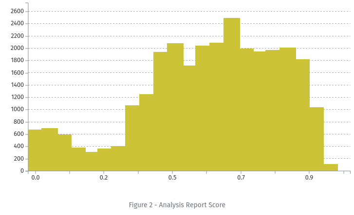
{
    "title": "Analysis Report Score",
    "kind": "histogram",
    "data": {
        "data": [
            {"x": 0.03152173913043478, "y": 677},
            {"x": 0.07456521739130434, "y": 701},
            .....
            {"x": 0.9354347826086957, "y": 113},
            {"x": 0.9784782608695652, "y": 0}
        ]
    },
    "style": "col-12"
}
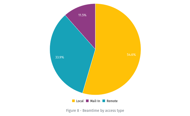
Pie Charts
{
    "title": "Beamtime by access type",
    "kind": "pie",
    "data": {
        "colors": "Live16",
        "data": [
            {"label": "Local", "value": 2431.0, "color": "#FFC107"},
            {"label": "Mail-In", "value": 514.0, "color": "#8F3A84"},
            {"label": "Remote", "value": 1511.0, "color": "#17A2B8"}
        ]
    },
    "style": "col-12 col-md-6"
}
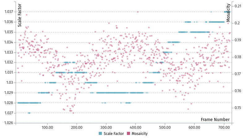
Scatter Plots
{
    "kind": "scatterplot",
    "data": {
        "y1": [["Scale Factor", 1.028, 1.028, ..., 1.037, 1.037]],
        "x": ["Frame Number", 1, 2, ..., 719, 720],
        "y2": [["Mosaicity", 0.17342, 0.18236, ..., 0.18954, 0.19437]]
    },
    "style": "half-height"
}
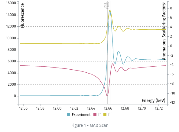
Line Plots
{
    "title": "MAD Scan",
    "kind": "lineplot",
    "data": {
        "x": ["Energy (keV)", 12.5567, 12.5847, ..., 12.7167, 12.7287],
        "y1": [["Experiment", 154, 145, ..., 6386, 6290]],
        "y2": [["f`", -4.13, -4.34, ..., 3.51, 3.46]],
        "x-label": "Energy (keV)",
        "y1-label": "Fluorescence",
        "y2-label": "Anomalous Scattering Factors",
        "aspect-ratio": 1.5,
        "annotations": [
            {"value": 12.662700000000001, "text": "PEAK"},
            {"value": 12.6597, "text": "INFL"},
            {"value": 12.7287002, "text": "REMO"}
        ]
    },
    "id": "mad",
    "style": "col-12"
}
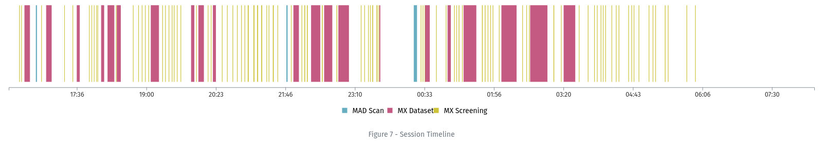
Timelines
{
    "title": 'Session Timeline',
    'kind': 'timeline',
    'start': 1583360100000,
    'end': 1583418044000,
    'data': [
        {'type': 'MAD Scan', 'start': 1583362067000, 'end': 1583362117000, 'label': 'MAD Scan: 000000-1111'},
        ...,
        {'type': 'MX Screening', 'start': 1583389899000, 'end': 1583389905000, 'label': 'MX Screening: TEST-02-screen'},
        {'type': 'MX Dataset', 'start': 1583365013000, 'end': 1583365193000, 'label': 'MX Dataset: TEST-02'},
        ...,
        {'type': 'MX Dataset', 'start': 1583367894000, 'end': 1583368141000, 'label': 'MX Dataset: Sim-01'},
        {'type': 'MX Dataset', 'start': 1583386783000, 'end': 1583386807000, 'label': 'MX Dataset: Sim-02'}
    ],
    'style': 'col-12'
}